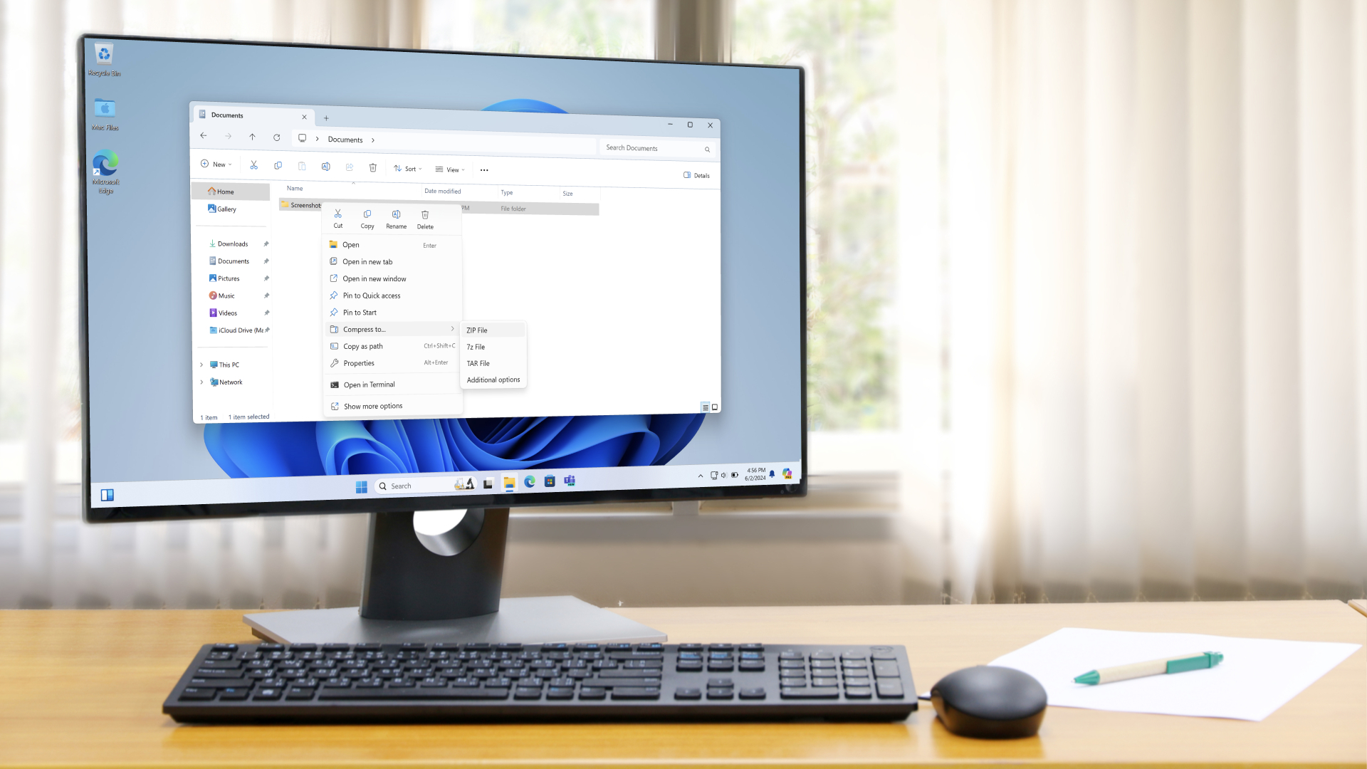
Windows 11 won’t be getting a simplified date and time panel in the taskbar, an idea that was introduced in preview builds in the past, and the reason is simple – testers hated this more streamlined look (apparently).
The rejig of the date and time display dropped the year, so it only showed the day and month, as well as also ditching the AM or PM label from the time. The result was a space-saving measure in the system tray – freeing up about the width of an icon – which worked quite effectively, I thought, to streamline this part of the taskbar (at the bottom-right of the desktop).
Windows Central’s Zac Bowden remembered that this change had been paused in testing – and then never reintroduced – and asked on X as to when it might return, receiving a reply from Microsoft‘s Brandon LeBlanc (senior product manager for Windows).
The feedback we got about that was not pleasant. That’s why is disappeared.July 12, 2025
As LeBlanc indicates, there was clearly quite a lot of negative feedback about this idea, and therefore it was abandoned.
There was another space-saving tweak accompanying this change, whereby the notifications bell didn’t appear in the system tray when ‘Do not disturb’ mode was switched on. That, too, has been scrapped.
Analysis: a middle road not worth the effort?

Do we need the year shown in the clock display in the taskbar? I’d argue very much not (though it may be handy for time travellers, perhaps – newspapers being trickier to find these days for that all-important year reveal). As for the indication of whether it’s morning (AM) or afternoon (PM), there’s perhaps more of a case for that, though again, I don’t think it’s needed (and I use the 24-hour clock anyway, rendering it redundant, of course).
I appreciate that some folks may not like the look of the new, slimmed-down clock and date info, and that’s fair enough. So, my question for Microsoft is: why not just have a choice of which configuration you want? It seems like a simple enough compromise to let folks choose, and indeed an option to have the more compact affair, or the standard date and time, was present in testing way back when. (You could toggle ‘Show time and day in the system tray’ under the Date and Time options in the Settings app).
Choosing what you want – isn’t this the best of both worlds? And if Microsoft was worried about the change confusing people, the company could have simply made the traditional form the default – and the compact mode a change you needed to opt-in for (by switching the relevant setting).
I don’t see how this wasn’t the path chosen, frankly, unless Microsoft thought that so few people wanted the new (abandoned) layout that it wasn’t worth the effort to implement the tweak (or that it was bulking up taskbar options unnecessarily, as there are already quite a few).
Even if it was the case among testers that the change was pretty much universally hated – which I can only assume was the case – Microsoft must remember that those Windows Insiders are more hardcore enthusiasts whose views may not reflect the broader computing public. Indeed, looking at some of the reaction online, it’s clear there’s some feeling that the compact view for the date and time was appreciated in some quarters (and yes, still shot down in others, to be fair).
Am I just nit-picking here? Yes, to an extent, and of course this is far from the biggest problem with Windows 11 – this is comparative small fry, naturally – but it still feels odd to me that Microsoft didn’t at least compromise here and provide a choice.